On Tuesday I was given a choice of two projects to do either the Blue Peter Project where I would have to come up with an idea of something new that the viewers could make or the Stockport Fairtrade Project where I would have to design an illustrated fairtrade alphabet. I chose the latter because I felt that it would be more suited to my style and am interested in printing over making.
I have begun to collect research for the project- examples of other illustrated alphabets, 3 colour risograph prints and pictures of items which are fairtrade.
Thursday, 28 February 2013
Tuesday, 26 February 2013
Final Wind in the Willows Book Cover
For my final Book Cover Design, I scanned in the prints which I wanted to use for the design and added them onto the template we had to use on photoshop. I decided to add add a border from a pattern of one of my other prints to make it stand out more. The type face I used for the title of the book was Cooper Black, I chose it because it was neutral in terms of style- not too childish or serious and it stands out well.For the main image I only used two colours , which contrasted so that the characters faces would stand out more. I added in the leaf patterns from another of my prints to break up the image and focus the viewers attention. On the back I chose to only have small images/patterns as the focus is the blurb.
Sunday, 24 February 2013
More Wind in the Willows Prints
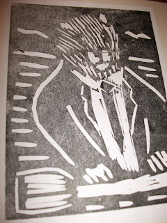
Here are some more print designs I did for the Wind in the Willows book cover. On some of the prints I experimented using different colours.
Thursday, 14 February 2013
Wednesday, 13 February 2013
Wind in the willows sense of place illustrations Ratty
Here are some illustrations I did of the character Ratty. I used pencil ink and biro to create them.
Wind in the willows sense of place illustrations mole
Here are some illustrations I did of the character mole. I used biro pen, pencil, ink and watercolour paints to create them.
Wind in the willows sense of place illustrations Toad
Wind in the williows sense of place illustrations Badger
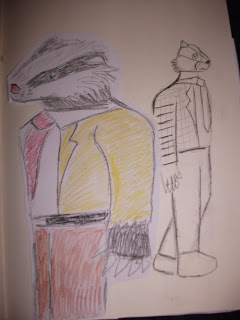
Here are some illustrations I did of the character Badger. I used oil pastels, biro, ink , pencil and watercolour paints to create them.
Are illustrations that move just gimmicks?
A week ago I was put into a group at college and was asked to present a discussion forum to other members of my class about certain topics within illustration including are illustrations just gimmicks? Traditional vs Digital media.
In my opinion, they are interesting at first , but they get boring quickly because there is only one frame. Not much happens and they don't really tell a story. They are repetitive unlike most animations.Rebecca Mock The quiet ones

Main street blues

For traditional (books/magazines/newspapers) and digital ( internet) I wrote a list of pros and cons for each:
Internet Pros: Cheaper/free, won't lose it, can't get damaged or ruined online, instant access, convienient- can use it whenever you want as you dont have to wait until the shops open
Internet Cons- It might be slow/not work,can be fidgety, killing the traditional industry, u
unreliable sources,encourages you to be lazy
Wind in the Willows Sense of place research
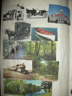
Over the course of this project I have kept a sense of place book to use for inspiration for ideas for the project . This includes pictures of the animals that the characters are based of and artist/illustrators work which I felt had a Wind of the Willows feel to it to inspire my own work.
Here are they are:

Image From:http://www.creativematch.com/flair_largeImage.cfm?flairID=5409


![Spring-by-Hannah-Firmin[1]](http://www.nightingaleproject.org/wp-content/uploads/Spring-by-Hannah-Firmin1-300x293.jpg)
Image From:http://www.handsomefrank.com/illustrators/helen-musselwhite/
Here are they are:
Felix Gephart
Felix Gephart
is a German illustrator. In terms
of colour, his work that I have been looking at has been done in black and white;
this contrast makes it stand out. His illustrations
are very detailed and there is a strong use of tone which makes them look
realistic in style. I chose to look at
his work because of the links to nature and as inspiration for the type of
style/colours I could use in my own work. He uses print based media to create his illustrations.
Mae Besom
Mae Besom is a Chinese children’s book illustrator who uses
both traditional media such as pencil and watercolour paintsand digital media such a photoshop to create her work. The styles she works in are simplistic and
cartoonish. She works in both black and white and in colour. In her colour work there is no particular colour scheme she uses. I chose to look at
her work because it has natural themes and feature anthropomorphic animals

Image From: http://illustrationweb.blogspot.co.uk/2010/06/mae-besoms-scrapbook.html

Image From: http://illustrationweb.blogspot.co.uk/2010/06/mae-besoms-scrapbook.html
Alice Stevenson
Alice Stevenson is an English Pattern based
illustrator who uses a combination of flat colour and texture in her work. She uses print based media to create her
work. I chose to look at her work
because of its links to nature.

Image From:http://arts.brighton.ac.uk/faculty-of-arts-brighton/alumni-and-associates/associates-and-alumni/graphic/alice-stevenson

Image From:http://arts.brighton.ac.uk/faculty-of-arts-brighton/alumni-and-associates/associates-and-alumni/graphic/alice-stevenson
Jan Feindt
Jan Feindt is a German Print based illustrator. Her work is
very tonal, giving it a realistic look. I chose her work because of the natural themes.

Image From:http://www.janfeindt.de/

Image From:http://www.janfeindt.de/
Silja Goetz
Silja Goetz is a German illustrator who uses a
combination of flat simplistic backgrounds textured subjects. I chose to look
at her work because of the links to nature. She uses digital media to create her work. In terms of colour, she works in black and white.

Image From:http://razzmag.wordpress.com/2011/02/15/silja-goetz-an-illustrators-profile/
Image From:http://cutlipdesigns.blogspot.co.uk/2011/04/ive-been-thinking-lot-about-fine-art.html
Katherine Asher

Image From:http://razzmag.wordpress.com/2011/02/15/silja-goetz-an-illustrators-profile/
Greg Becker
Greg Becker is an English illustrator. He uses traditional
media such as watercolour, acrylic, ink and coloured pencils to create his
work. I chose his work because of the natural themes.

Image From:http://www.directoryofillustration.com/ArtistPortfolioLarge.aspx?AID=4438&IID=98970

Alexandra Ball
Alexandra Ball is an English children’s book illustrator.
She starts of her illustrations by drawing the characters and settings with
pencil, then uses Photoshop to colour them and create patterns and textures. She works in a simplistic, cartoonish style.
The colours she uses are realistic and she uses some tone . I chose to look at
her work because of the natural themes and animal characters.

Image From:http://www.directoryofillustration.com/ArtistPortfolioLarge.aspx?AID=4438&IID=98970

Image From:http://cutlipdesigns.blogspot.co.uk/2011/04/ive-been-thinking-lot-about-fine-art.html
Katherine Asher
Katherine Asher is an English freelance illustrator who
focuses on strong traditional drawing. Her style is loose and painterly. She
uses flat colours in her work, which are either realistic or bright.I chose to
look at her work because of the natural themes and animal characters.
Alan Baker
Alan baker is an illustrator who works in a realistic style.
He uses colours which the characters/backgrounds of his illustrations would be
in real life. I chose to look at his work because of the natural themes and
animal characters.
Shailesh Khandeparkar
Shailesh Khandeparkar is an Indian illustrator. The colours
he uses are black and white; his illustrations are intricately detailed and
have a textured feel to them. I chose his work because of the natural themes .
Image From:http://craigbaldwin.com/blog/2009/03/illustration-collection-volume-2/
Owen Carson
Owen Carson is an American illustrator who specializes in background
illustrations. His work is very detailed, giving it a realistic feel. It looks 3D and naturalistic. I chose his
work because of the natural themes.

Image From:http://www.creativematch.com/flair_largeImage.cfm?flairID=5409
Mocchi Mocchi
Mocchi Mocchi is a Japanese illustrator. The illustrations
are flat looking in some areas and textured in other areas. They use print
based media to create their illustrations. I chose to look at their work
because of their links to nature.

Amy sol
Amy sol is an illustrator who uses
patterned backgrounds and tones. I chose her work because of the natural
themes. She uses a color scheme for her work that I have been looking at.

Image From:http://artattacksonline.com/2011/10/amy-sol/
![Spring-by-Hannah-Firmin[1]](http://www.nightingaleproject.org/wp-content/uploads/Spring-by-Hannah-Firmin1-300x293.jpg)
Hannah Firmin
Hannah Firmin is a British print based illustrator whose
work has a textured feel to it. Realistic colours are used; tone is used giving
the image a more 3D look. I chose her
work because of the natural themes. She uses a variety of colours in her work.
Helen Musselwhite
Helen Musselwhite is a British illustrator, who has 3D
elements in her work. Her illustrations are paper/material based and are
intricately detailed. I chose her work because of the natural themes. There is a lack of colour in her work,
Image From:http://www.handsomefrank.com/illustrators/helen-musselwhite/
Yoko Furusho
Yoko Furusho is a Japanese illustrator whose work is
detailed and busy . There are a variety of different textures in her work, in
contrast some areas are flat. I chose
her work because of their links to nature. The style she uses is decorative/
cartoony. In terms of media she uses ink and acrylic to create her work. Her
work is inspired by fashion. She uses a variety of colours in her work.
Marcos Chin
Marcos chin is a Canadian illustrator. There is a mixture of
flat and more detailed areas in his work. I chose his work because of the
natural themes. He uses mainly digital media with some traditional elements to
create his work. He uses a variety of colours .
Image From:
http://illustrationproject2012.blogspot.co.uk/2012/10/work-by-marcos-chin.html

Phillip bannister
Phillip Bannister is a British illustrator. He uses
watercolour, brush and ink and line and wash to create his work. I chose his
work because of the natural themes
Greg Becker
Greg Becker is an English illustrator. He uses traditional
media such as watercolour, acrylic, ink and coloured pencils to create his
work. He uses realistic colours. I chose his work because of the natural themes.

Image From: Illustration Web
Subscribe to:
Comments (Atom)


